Due Time Ranch & Due Time Events
Overview
I led the brand identity design for Due Time Ranch and its sister brand, Due Time Events, and launched the marketing campaign for their Easter Egg Hunt event. The goal was to create a cohesive, recognizable look that felt local, family-friendly, and authentic, while remaining flexible enough to perform across digital, print, signage, and merchandise.
Brand & Campaign Goals
Due Time Ranch needed a strong identity that could resonate with a local audience while also supporting a growing events arm. The system needed to feel:
- Trustworthy and community-based
- Family-friendly and welcoming
- Versatile for both ranch branding and event promotion
- Scalable across social graphics, posters, banners, and merch
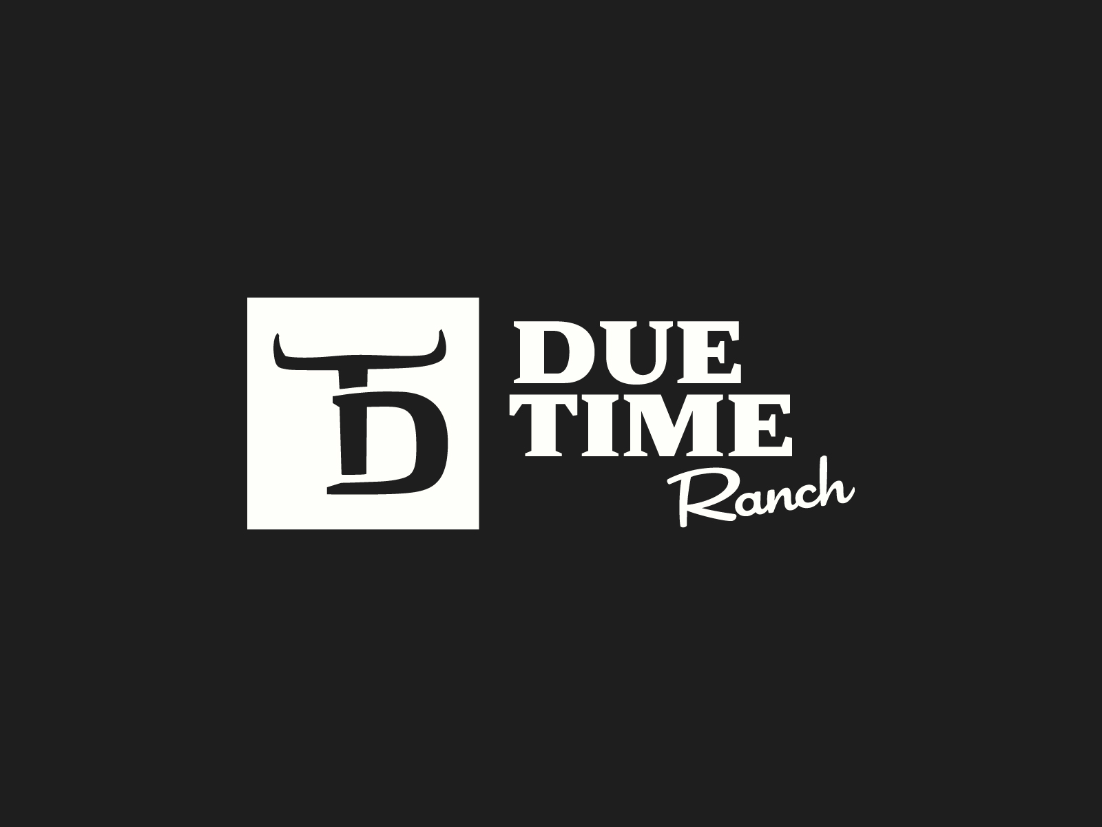
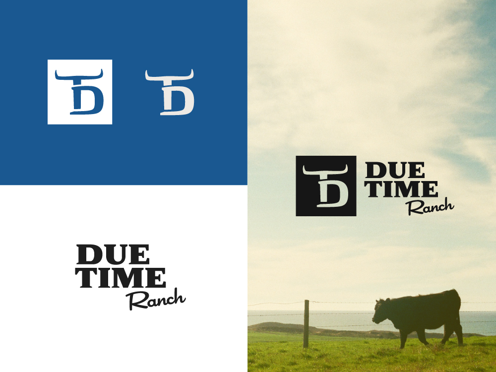
Brand System
To establish the brand system, I developed:
- Logo + alternate lockups
- Color palette and typography system
- Supporting visual elements for consistent brand expression
Scope of Work
This project expanded beyond design into campaign execution and content production. Responsibilities included:
- Brand identity + campaign creative direction
- Social media and print deliverables
- Landing page and website support
- Email sign-up strategy + email blasts
- Digital ads and promotional graphics
- Sponsor communication and coordination
- Photography and video capture for marketing content
- Post-event content creation (highlight reels, recap posts)
To capture the event at its best, I coordinated with a drone operator and directed the shot list, then used the footage to create post-event content that helped build awareness for future events.
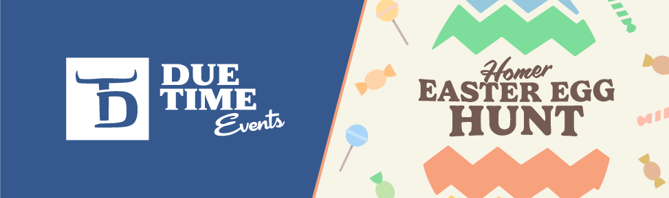

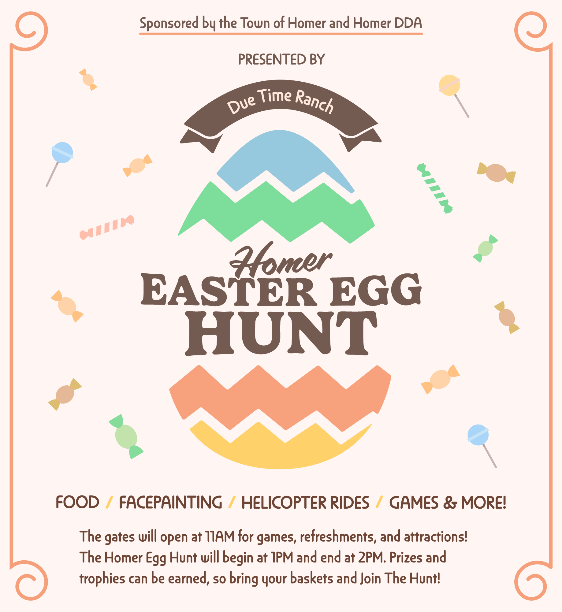
Easter Egg Hunt Campaign
For the Easter Egg Hunt campaign, I designed a full promotional suite, including:
- Posters and print collateral
- Social media graphics (multiple sizes and formats)
- Email newsletter graphics and layouts
- Event-focused landing page assets and digital promotions
Challenges
Event campaigns move fast — and everything needs to stay consistent across formats.
- Fast turnaround + constant resizing: Promotional assets required quick revisions and multiple platform variations while maintaining a cohesive look.
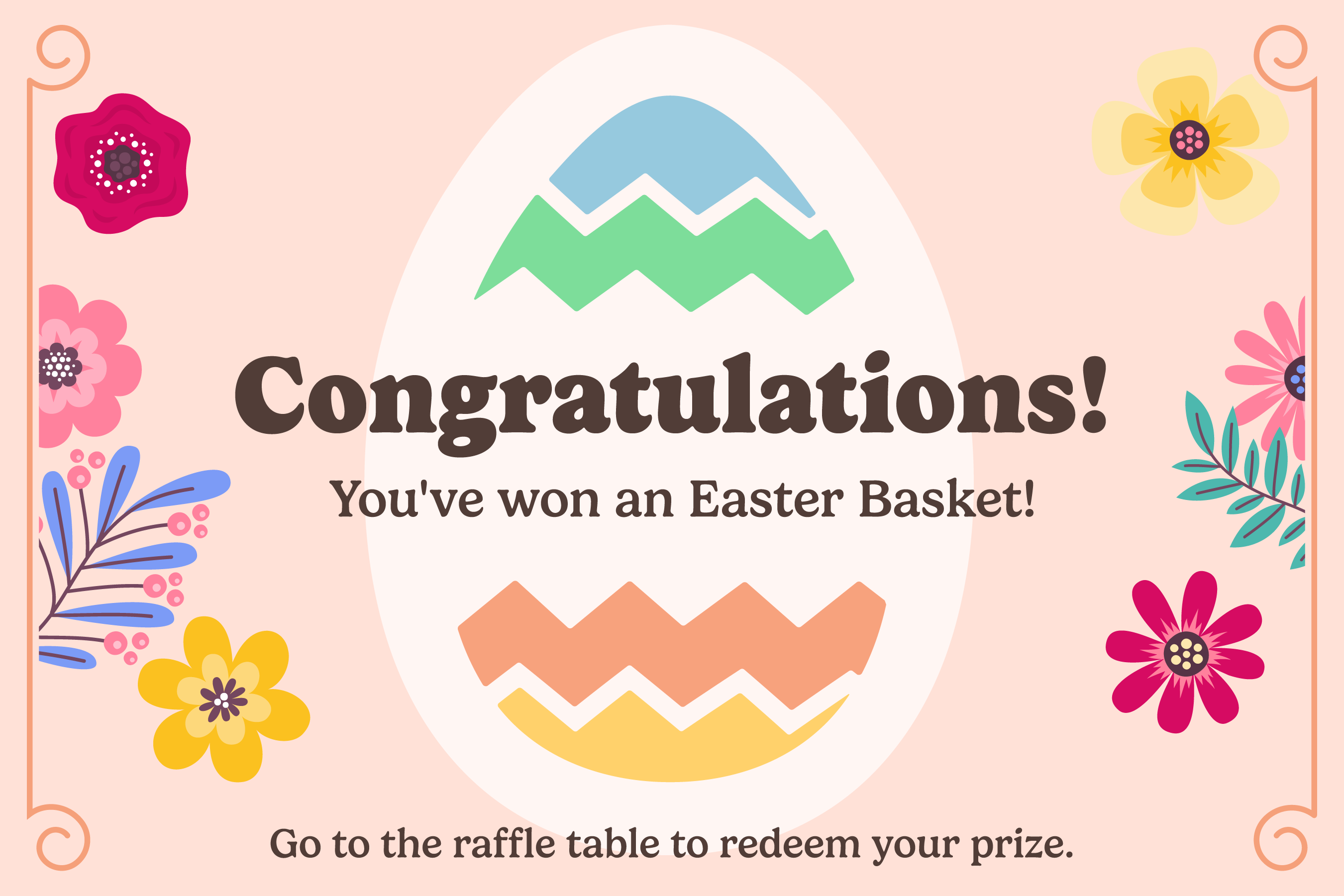
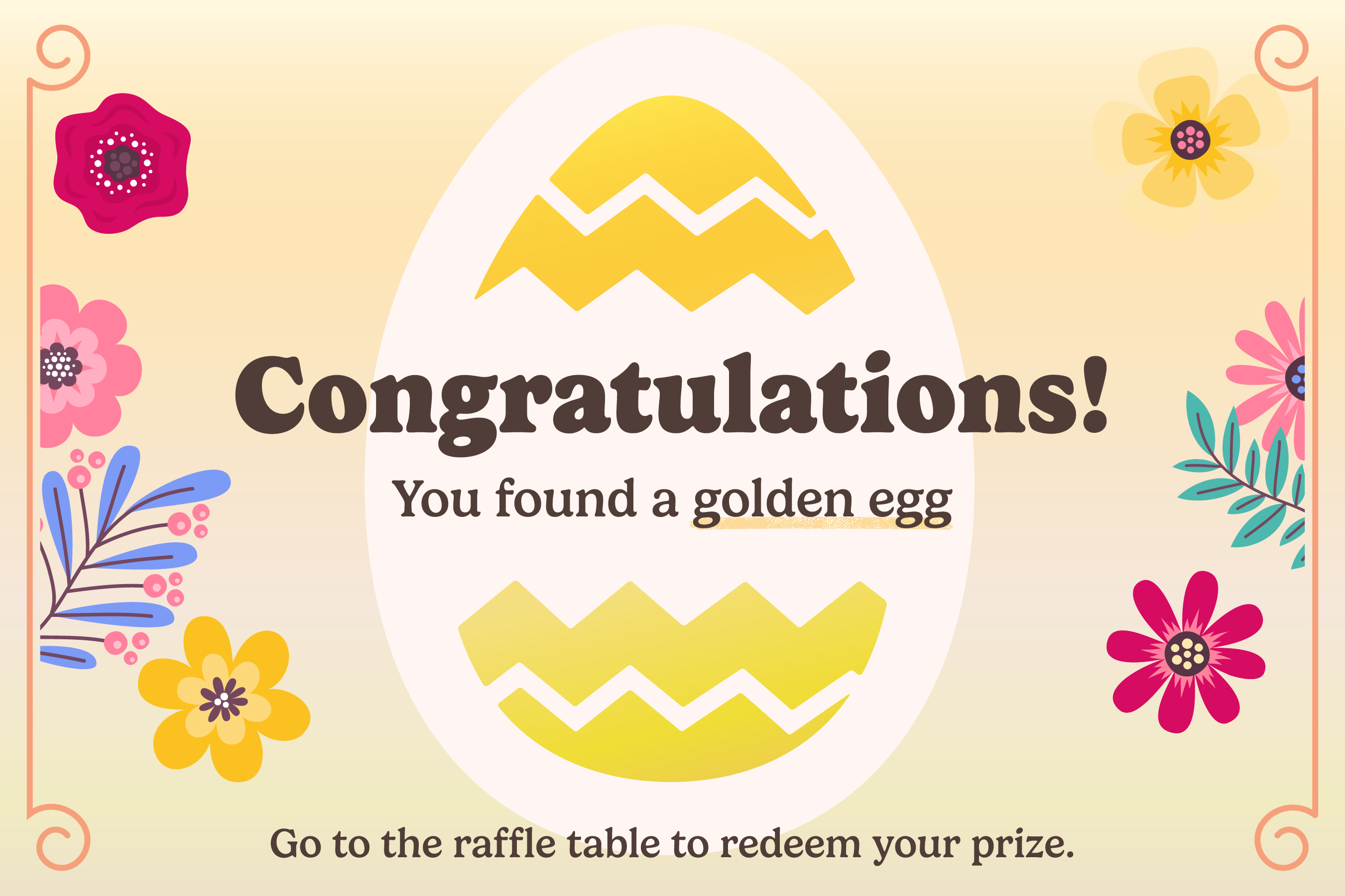
- Small-format print constraints: The “ticket inside the egg” concept required branded print pieces that were tiny, readable, and fun without losing clarity.
- Balancing rustic + modern: The identity needed to feel grounded and ranch-authentic while staying clean enough for modern marketing.
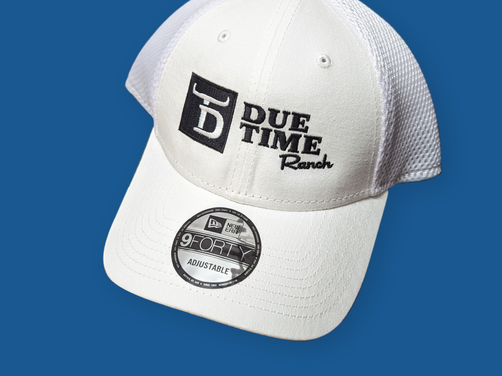
Key Design Decisions
- High contrast for strong visibility across signage, apparel, and outdoor use
- Compact mark + flexible lockups to work in tight spaces and wide layouts
- Monochrome-ready system for easy reproduction in print and embroidery
- Clear typographic hierarchy to preserve readability at small sizes
- A distinct brand mark strong enough to stand alone for merch, profile icons, and badges
Outcome
The Easter Egg Hunt campaign exceeded expectations and became a community-wide talking point.
- Attendance surpassed the projected range of 1,000+ visitors
- Guests traveled from up to an hour away to attend
- The event gained strong word-of-mouth momentum and was picked up by local news coverage
The success of the campaign led to continued work — I supported the Easter event for the following two years as well, expanding and refining assets year over year. This project showcases my ability to build a complete brand system and execute a multi-channel event campaign — from identity design to production-ready deliverables and post-event content that drives ongoing awareness.